
After completing a brand revitalization, Camp Fire was ready to ramp up and redesign their corporate website.
Camp Fire was founded over 100 years ago to help guide young people on their journey to self-discovery. What was initially established as an all-girls camp had grown to over 60 charters across the U.S. However, things continued to evolve. In the '70s, Camp Fire became a co-ed camp, and in the late '80s, they started focusing on teen leadership. More recently, they completed a brand revitalization.
The brand rejuvenation inspired the organization to rework their corporate website. There was a recognizable engagement gap, information was disorganized and overwhelming for their various audiences (e.g., teens, parents, funders, and charters), and the user experience was poor. During this time, they also decided to upgrade their technology, which meant their website had to be compatible.
Camp Fire brought on TANK New Media (TANK) to handle the project, trusting they could handle the complexity and ensure uninterrupted business processes.
A complete overhaul of web content and site organization allowed user segments to get fired-up about Camp Fire
At the beginning of the website redesign, it was apparent that Camp Fire needed to update content, videos, and images to improve user experience. The site had a good foundation, but it needed a serious update to its content and hierarchy.
TANK designed new page layouts, improved the site structure and primary navigation, and enhanced overall flow to help guide users through the site naturally. They also put top-level navigation items like Programs, Volunteer, and Donate in more prominent locations and made necessary but less essential items like Alumni and Councils smaller and less bold.
After reorganizing and upgrading the site navigation, TANK focused on the layout and structure of pages.
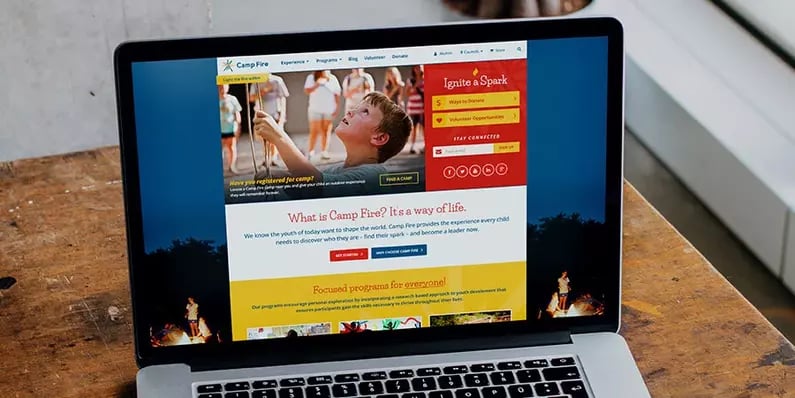
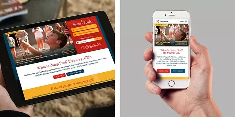
Previously Camp Fire had the majority of their content in a single-column template, making it overwhelming to digest. TANK reworked these layouts to feature sections and panels to make the content digestible and easy to skim. These changes also made it easier to organize content intended for different audience segments (teens, parents, donors, volunteers, etc.). Visitors could quickly find program information or experiences that they were looking for effortlessly.

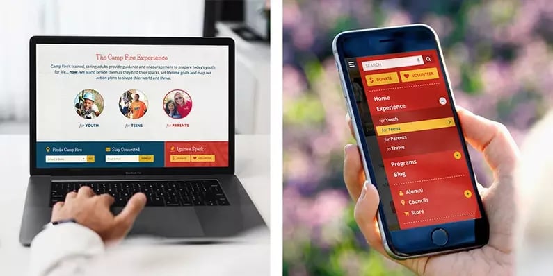
TANK also designed a custom sidebar navigation for detail pages so that users were always reminded of the easiest ways to engage and interact with Camp Fire. The sidebar navigation allowed visitors to quickly jump into opportunities that helped to drive the Camp Fire mission forward.
A visual system upgrade helped create excitement and caused the nonprofit’s mission to catch fire
One major problem with the previous Camp Fire website was its failure to communicate the leadership's excitement and enthusiasm. The camp mission was to help every child discover who they were by finding their spark. This remarkable mission needed a website that matched its intensity.
Pulling inspiration from the existing logo, TANK redesigned the website using more bright and vibrant colors to create excitement and cultivate engaging online experiences. To create an emotional appeal, the new site featured more photography and images. Camp Fire had an extensive library of photos that TANK leveraged on the site to showcase the opportunities and programs available at the leadership camp. These images provided a behind-the-scenes look at every aspect of Camp Fire, igniting a shared sense of community, comradery, and inspiration for charters, campers, parents, donors, and volunteers alike.
For a nonprofit organization that had just gone through a significant brand revival, it made sense to build on it by establishing a website presence that matched in intensity and ignited a spark of excitement.
After the completion of the website redesign project, Camp Fire had a solid foundation for engaging with their primary audience and local community — creating a pathway for ongoing youth development and leadership training.