

How can you increase website traffic? Make yourself searchable, give your visitors answers, and then inspire them to take action.
This is the first post in a three-part series that's focused on website redesign must-haves that will help you increase your website traffic, convert more leads, and drive up sales.
Most people spend less than 15 seconds on a website before they click away. So, how do you grab their attention, keep them interested, and inspire them to take action?
It’s about giving your users the right mix of thoughtful design and engaging content that’s simple to navigate whether they’re on a desktop or mobile device. Your website represents who you are and what you offer, so make your redesign count.
When people see your website for the first time, they’re thinking:
- Am I in the right place?
- Is this site credible?
- Is this a professional company?
- Is it trustworthy?
- Is this company stable?
- Can I quickly find what I want?
Here are some things you can do to make your website redesign interesting and engaging so that your visitors will want to stay longer and learn more.
Form and function are equally crucial in website redesigns.
If the study, “How Do People Evaluate A Website's Credibility?" by the Persuasive Technology Lab, Stanford University, and Consumer WebWatch taught us anything, it should be that a website’s design and its use of multimedia is more important than credibility indicators such as having a privacy policy, awards, or certifications.
What can you do to make your website’s design compelling and effective? Here are some tips.
- Proper use of color: Use the right colors for your brand and audience to draw attention to select elements. Don’t try to make everything jump out. The result will be just the opposite — nothing will stand out. Avoid a chaotic mix of colors on your website; instead, pick two to four colors to use across all marketing platforms.
- Animations, gadgets, and media: Avoid anything unnecessary. Using a ton of video backgrounds, excessive parallax, or distracting animated effects just because they look cool is the wrong strategy. In most cases, it’s best not to use an animated background or background music. Only use media and animations to help support written content.
- Layout: Create a clear navigation structure, and organize page elements in a grid fashion (as opposed to randomly scattered). Also, don’t be afraid of white space and avoid clutter!
- Typography: Make sure your website is legible. Use fonts, font sizes, and font colors that are easy to read. For easier page scanning, use bullet lists, section headers, and short paragraphs. If your site is English-based, make sure the information flows from left to right and top to bottom.
A well-designed website redesign might convince visitors to take a closer look, but they won’t look twice if the content isn’t useful and organized. After all, you never get a second chance to make a first impression!
Mobile-friendly websites are more important than ever before.
The number of people accessing the Internet from a mobile device has already surpassed the number of desktop users. So, if your website isn’t mobile friendly, it’s likely that you’re missing out on valuable web traffic.
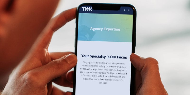
Having a mobile-friendly website will not only increase your website traffic, but it can also help improve your search rankings on Google. Why? In April of 2015, Google expanded its use of mobile-friendliness as a ranking signal — which means that more mobile-friendly sites will appear in online search results.
Know your target audience, their interests, and their needs.
Well-defined buyer personas can help you create customized and relevant content that they’ll find useful and engaging. What’s the point of getting more traffic if your website isn’t helpful? Additionally, focusing on buyer personas can help you stay focused on the task at hand — guiding your visitor along the buyer’s journey — and avoiding common pitfalls.
Remember, if your content isn’t helping your prospect find what they’re looking for, they’ll be off to their next Google search long before you have the chance to capture their email address.
Also, for the sake of your website visitors, keep key elements — colors, sizes, layout, spacing, tone/voice, navigation — of your website redesign congruent from page-to-page. This will prevent them from feeling lost, confused, and frustrated.
Perhaps one of the biggest factors to keep visitors on your website is having a clear navigation system that can support all search inquiries. In fact, more than three-quarters of survey respondents from a recent HubSpot study say that the most crucial element in a website redesign is ease in finding information.
Include these important factors in your website navigation so that your visitors — especially your target audience — can find what they need.
- Keep the structure of your primary navigation simple and near the top of your page.
- Clearly show where the user is located, and how they can get back to the previous page.
- Include a Search box near the top of your site so visitors can search by keywords.
- Don’t offer too many navigation options on a page.
- Keep your navigation to no more than three levels deep.
Here’s the general rule of thumb: don’t require your visitors to have to think about where they need to go and how to get there. Navigation should be effortless for visitors.
Website redesigns need powerful images — but they should be used wisely.
Stock images are seen everywhere because they are easily accessible and inexpensive. But are they good to use?
Marketing Experiments performed a test comparing the use of stock photography versus real imagery on a website and their effects on lead generation. What they found was that photos of real people out-performed the stock photos by 95%. Why? Because stock images tend to be irrelevant. Resist the temptation to use photos of fake smiling business people.
Go the extra measure to use meaningful images on your site. Every image is transmitting a subconscious message to your audience, and sometimes the result is different from what we might expect. Listen to this podcast by Marketing Experiments to learn how the right balance of images and copy can increase conversion by 29%.
You can create the best website redesign, but it won’t help you achieve your business goals if it doesn’t work.
Quality assurance testing is the most vital step in launching a website redesign. It helps to ensure that your website looks and functions the way it should no matter what browser or device your prospect is using. Best-practice quality assurance measures and confirms that your website is consistent, whether a visitor is using Chrome, Safari or Internet Explorer on a desktop, tablet, or smartphone.
If you want more website redesign must-haves that will increase your website traffic, download our eBook, 26 Website Redesign Must-Haves for Driving Traffic, Leads, and Sales.