
With the ability to redefine retail displays and spaces, InStore needed a brand update and logo design that communicated and aligned with their mission.
Initially founded in 1910 as National Equipment Company, InStore Design Display began to experience a transition early in the 2000s. They started to focus less on stock fixtures and more on designing and building custom displays and retail environments for clients. Over time, this allowed them to evolve into a nationally recognized custom product display and retail environment company.
However, during this growth period, a confusing message developed in their marketplace. InStore found many of their customers still saw them as a stock fixture company when what they were trying to communicate was their ability to create innovative solutions to problems that resulted in exciting and engaging custom displays for retailers and product brands.
According to InStore Design Display, the marketplace saw them as a manufacturing company, or a stock fixture company, not a custom display company or a retail environment company. It was disorienting and frustrating for not only their customers but their team as well.
This situation led to a strategic planning process to uncover and develop a clear understanding and vision for InStore Design Display’s future.
This strategic planning helped InStore Design Display define themselves, and they were able to hone in on their strengths, and clarify what industries their skills were most successful in, and re-define their purpose and mission. Next, it was time to communicate all this to their audience and begin rebuilding their brand.
That’s when they reached out to us — the team at TANK New Media — to partner with them in finding a solution to their brand image. The project included a logo design, a refreshed brand image, and a new website presence that communicated how they work with and help clients achieve their goals.
Success comes from the extraordinary story behind the logo, not the logo design itself.
Our mission was clear: we needed to create a brand experience that matched the extraordinary experiences that InStore Design Display delivers in custom product displays and retail environments.
InStore Design Display excels in creating engaging, custom solutions because retailers demand more than standard solutions. And the InStore logo and brand couldn't (scratch that) — wouldn't be a standard solution either.
We kicked off the branding process by looking at the brand essence or rationale. We felt that before we could start brainstorming the visual system for the brand, we had to understand the what and how first. We need to make sure we could clearly communicate what the brand was going to stand for and how the InStore Design Display experience is unique.
InStore Design Display has concept design, engineering, production, global-sourcing, warehousing, and fulfillment all under one roof — allowing them to solve the problem faster, better, and on budget. They believe in and strive to build long-term customer relationships through the execution of excellent customer service and the understanding of consumer trends.
The team at TANK felt that this meant focusing on the human attention InStore Design Display provides in every interaction of their business as well as their proclivity to problem-solving.
From this, the rationale developed: “Creating a great buying experience is fulfilling a practical or rational need for customers. But that end result is really just the beginning. The deeper corresponding emotional benefit is knowing that by working with InStore, you're building something bigger, something successful. A business, a career, a life . . . exactly what is up to you. There's more InStore.”
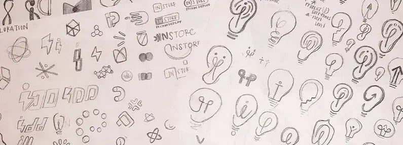
As we began to explore possibilities for the InStore Design Display logo mark, we considered imagery from a variety of themes.
For starters, we explored the idea of human connection. We looked at how we could show this touchpoint through abstractions of the human form, fingerprints, conversations, etc. We also considered highlighting the fact that InStore is continuously innovating. We looked at ways to showcase the engaging ideas that InStore generates with marks that reminisced a lightbulb or infinity mark.
We kept coming back to the rationale as a gut check to whether or not the logo design inspirations were still on track. Some marks started to develop qualities that possibly could have had something to build on; we didn't feel like we had found the perfect solution yet.
We started to focus on the line in the brand essence, "There's more InStore." How could we showcase this idea? We spent some time researching and came across the symbol of an asterisk. The asterisk is defined by Merriam Webster as "the character * used in printing or writing as a reference mark, as an indication of the omission of letters or words."
This was when things started heating up. This idea would fuel us to create a visual system and brand story that aligned to the way InStore wanted to define themselves. We started exploring a variety of forms that allowed us to turn a simple character on the keyboard into a distinguishable mark.

Through a couple of rounds of iterations and brainstorming sessions, we developed a brand and logo story that represented the InStore Design Display mission perfectly.


It was this story that ultimately inspired the final mark for InStore Design Display. We built a logo that took the original ideas that we felt were essential to the brand (creative solutions, authentic partnerships, innovative ideas, and the fact that there's more in store for retail brands) and translated them into a modern, energizing, and sophisticated logo.

The InStore logo redesign also subtly resembles a three-dimensional box which also aligns with their industry. InStore Design Display is focused on creating lasting impressions in the retail space. This often requires custom displays or the creation of an entire retail environment. These mediums aren't merely just on paper or online. They're three-dimensional experiences. So, this subtle nod to the 3-D idea helps reinforce the foundation of the brand.

To make a long story short, a rebrand for InStore Design Display didn’t just result in a new logo. It developed a brand story that represents everything their business has to offer, it created a consistent and cohesive visual system that aligns to the quality of experience they provide their clients, and it re-energized their internal team by providing them a mission and brand they truly believe in.
InStore Design Display is a brand that is now positioned to drive competitive advantage and profitable growth.
Build a rock-solid brand foundation, and you’ll be positioned for future growth as well.
We understand that the rebranding process can seem overwhelming, and sometimes it’s even confusing to know where to begin. But, don’t worry about a thing — we’re here to help!
We’re experts at understanding what makes brands unique and we’re committed to helping business take their brand experiences to the next level. Take a look at our branding and design services or start a conversation to see how you can start growing your brand.