Turning Traffic into Revenue: The Website Conversion Engine
 Krista
|

You have built a beautiful website. You are publishing content that resonates. Your traffic numbers are climbing. But if those visitors aren't taking action, your website is just a digital brochure—not a business asset.
Traffic is a vanity metric; conversion is where revenue begins. Turning anonymous browsers into known leads requires more than just "putting a form on the page." It requires a systematic approach to psychology, design, and value exchange.
Here is how to architect your website to convert leads and drive sales.
1. The Call-to-Action (CTA): Your Strategic Signposts
A Call-to-Action (CTA) is the bridge between passive consumption and active engagement. It tells your visitor exactly what to do next. Without clear CTAs, even interested prospects will drift away.
However, plastering "Click Here" buttons everywhere is not a strategy. Effective CTAs are:
- Visually Distinct: They should possess a visual hierarchy that separates them from the rest of the content. Use contrasting colors and ample whitespace so the next step is obvious.
- Contextually Relevant: Match the offer to the content. A visitor reading a high-level blog post might want a broad educational guide. A visitor on a pricing page is ready for a "Request a Quote" or "Schedule a Demo" prompt.
- Value-Driven: Avoid generic commands. Instead of "Click Here," use text that promises a result, such as "Get Your Free Guide" or "Start Your Trial."
Placement Matters
While "above the fold" is a classic rule, modern scrolling behavior has changed the game. Place CTAs where decisions are made—often after the user has read enough to be convinced. A good rule of thumb is to have a soft conversion (like a newsletter signup) available early, and a hard conversion (like a demo request) available as the user engages deeper.
2. The Landing Page: The Closing Room
When a visitor clicks a CTA, they should arrive at a dedicated landing page. Unlike a standard web page, a landing page has one singular purpose: to secure the conversion.
The Golden Rule: Remove Distractions
Effective landing pages often remove the main navigation menu. Why? Because you don't want the visitor to wander off to your "About Us" page right when they are about to fill out a form. You want them focused entirely on the offer at hand.
The Anatomy of a High-Performing Landing Page
To maximize conversions, your landing page should include:
- A Consistent Headline: Ensure the headline matches the CTA they just clicked. Disconnect here causes immediate bounce.
- Clear Value Proposition: Use bullet points to explain exactly what they will get and why it solves their problem.
- Visual Proof: Include an image of the ebook, a screenshot of the software, or a video walkthrough to make the offer tangible.
- Social Proof: Add a relevant testimonial or client logo near the form to reduce anxiety.

3. The Form: The Value Exchange
The form is where the transaction happens. It is also where the most friction occurs. In the prospect's mind, they are "paying" with their personal data. You must ensure the value you provide exceeds the cost of that data.
Balancing Friction vs. Qualification
There is a direct correlation between the length of a form and your conversion rate:
Short Forms (Email only): High conversion, lower lead quality. Best for newsletters or top-of-funnel assets.
Long Forms (Name, Company, Role, Budget): Lower conversion, higher lead quality. Best for bottom-of-funnel requests like consultations.
Only ask for information you actually need right now. If you don't need their phone number to email them a PDF, don't ask for it. It simply adds friction.
The Power of Progressive Profiling
If you are using a platform like HubSpot, you can utilize progressive profiling. This allows you to ask for new information each time a lead returns. On their first visit, you might just get an email. On the second, you ask for their job title. This keeps forms short while building a rich profile over time.
Stop Using "Submit"
"Submit" is a technical term that implies yielding to authority. No one wants to submit. Change your button text to reinforce the reward: "Download White Paper," "Reserve My Seat," or "Send Me the Kit."
Reducing Anxiety to Increase Trust
Even with a great CTA and a short form, anxiety can kill a conversion. In an era of data breaches and spam, users are protective of their information.
Privacy Assurance: Include a micro-copy link to your privacy policy or a simple statement like "We respect your privacy" near the button.
Eliminate Surprise: Be clear about what happens next. Will they get an email instantly? Will a salesperson call them? Setting expectations reduces the fear of the unknown.
Your Website is a Living Growth Engine
Launching these elements is just the start. The best marketers are scientists. They test button colors, headline copy, and form placements to see what drives the best results.
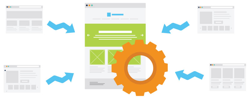
By integrating smart CTAs, focused landing pages, and low-friction forms, you transform your website from a static brochure into a 24/7 sales engine that feeds your team qualified leads.
Continue Your Research
Ready to audit your entire site for conversion gaps? We have compiled a comprehensive checklist to help you identify exactly what's missing.
Download the Guide: 26 Website Redesign Must-Haves for Driving Traffic, Leads, and Sales
Related Insights
Subscribe to Our Blog
Stay up to date with the latest marketing, sales, and service tips.


