

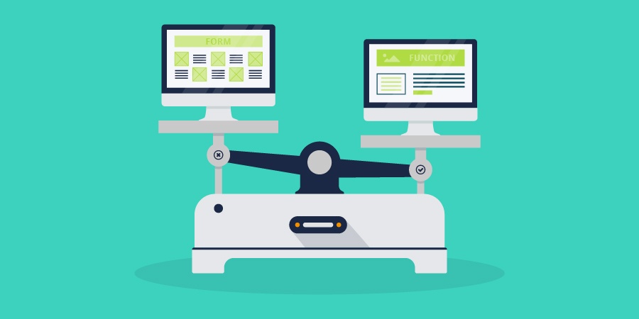
Imagine buying a car sleek, modern, and beautiful in form, but it doesn’t have any doors. Even though the vehicle looks great, there’s a major flaw in its functionality. This flaw renders the car useless. Websites are no different. One concept you should understand is the importance of the function over the beauty of the design. Your website might stand a chance if it contains useful content but needs some design love. But, if the user can't easily find the information they are looking for – you can bet your bottom dollar they will leave in an instant. A website with an amazing design doesn't reach its full potential if the user interaction is poor.
The function of a website boils down to the user experience. This encompasses ideas like usability, accessibility, and interactivity. Regardless of the medium, designs should always use these ideas to form a solution to the user’s needs. It won't be easy for users to see the value in your brand if it's frustrating for them to understand your website. That means it's important to be aware of every touch point the user will have with your site. If they can't see the value of the brand it ultimately means you could lose them as a customer. So, when thinking about how your website functions, consider the following three points:
Understand Your User:
You won’t be able to create successful web designs if you don’t have an understanding of your audience. Start your process doing some research on the market you’re trying to reach. Ask questions like... how much technology knowledge do they have? On what device do they typically receive information? Gathering this information will help you create a solid foundation for your website. It ensures the site not only looks great but allows users to easily interact with your brand.
Having a firm grasp on your user's demographic information can lead to tweaking your website in such a way that it should convert better on the backend. Mobile and desktop user-split is one of the first things you should be looking at to know whether or not you need to focus more on a mobile optimized site, or one for a desktop.
Keep It Simple:
Don’t overwhelm visitors with too many options. When pages are made to be simple and clean, it is easier to guide consumers to specific information. The Patagonia website is a great example of this point. The page has two main goals: guide a customer into making a purchase or create higher brand awareness. A series of images are also displayed on the homepage. These images not only capture the viewer's attention but reinforce the brand image. The navigation is simple making it easy to know what your options are: shop or learn more about Patagonia. In this instance less really is more!
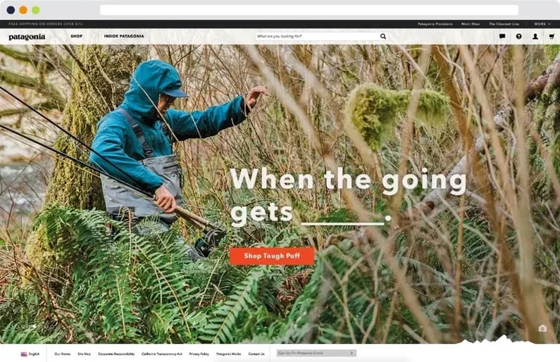 (Image from www.patagonia.com/home)
Tidy Things Up:
Think through the layout and organization of your site. Logically categorize items and group sections or pages that are similar. Use tools like listing pages or drop-down menus to help organize the content on your site. This helps users navigate to the specific information they are looking for. It also provides an opportunity to connect them with new or related information they might not currently be aware of.
It's important to understand the way your website functions is critical. But, that doesn't mean you have to ignore its design. You could probably get away with a website that showcases useful information but needs some design help. However, that doesn't mean you should. In fact, when your website functions well and has a killer aesthetic you've found the dynamic duo.
If you want more website redesign must-haves that will generate leads and improve sales download our eBook, 26 Website Redesign Must-Haves for Driving Traffic, Leads, and Sales.